PROJECT
WAV Design System
ROLE
Director, Product Design
SUMMARY
WAV's library of components that allowed the app to be built in an efficient and scaleable way.
WHAT IS A DESIGN SYSTEM?
A design system is a classification of components and process that is built and maintained to help efficiently develop consistent UX and UI patterns.
A company needs a design system because it is a scaleable and repeatable way to create products. A unified design system allows a company to build faster because the rules set in place allow developers to apply them without having a bottleneck with the design team. Ultimately, the design is a more cohesive experience that is understood more by the users.
LAYING THE FOUNDATION
Creating a responsive layout grid for website design is important to efficiently design for all screen sizes and orientations, it also ensures consistency across layouts. We also take these same principles and apply them to iOS and Android taking into account each platforms unique rules and nuances.
Responsive Web Grid
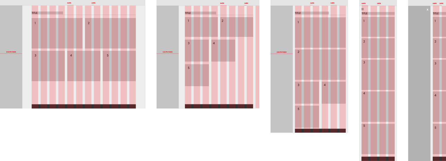
Mobile Grid
BUILDING THE LIBRARY USING ATOMIC DESIGN
We used the Atomic Design principles as a foundation to build upon. Atomic design is a methodology composed of five distinct stages working together to create interface design systems in a more deliberate and hierarchical manner. The most basic elements are grouped together to become the other stages. The five stages of atomic design are:
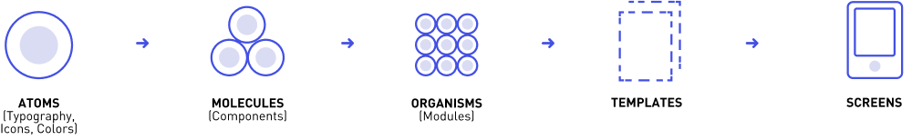
THE BUILDING BLOCKS
Base Elements
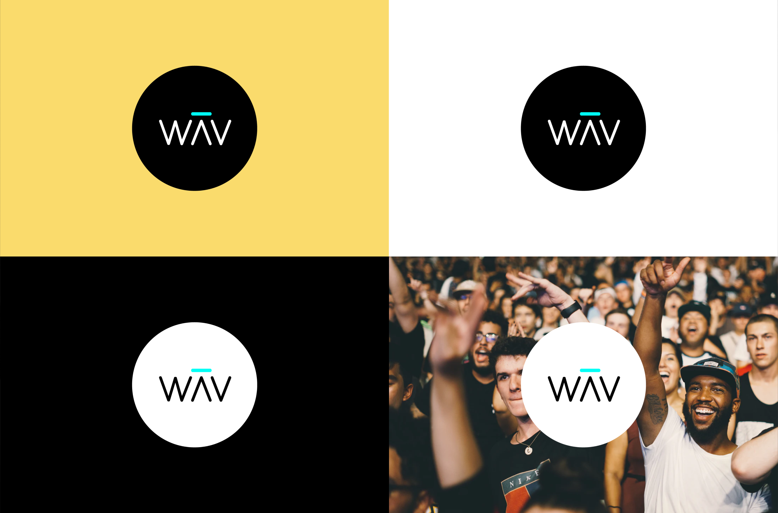
Atoms in interfaces are elements like like colors, typography, iconography, animations and transitions. They are considered global styles and are good for reference.
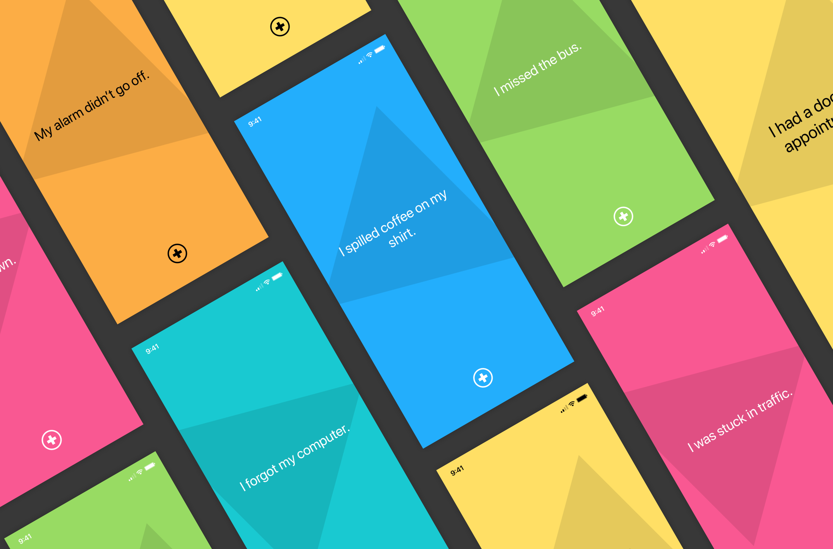
Molecules
When we combine the atoms together, they become molecules (components). They take on their own properties and serve as the backbone of our design systems. Molecules in our design system are buttons, tiles, list styles and content cards.
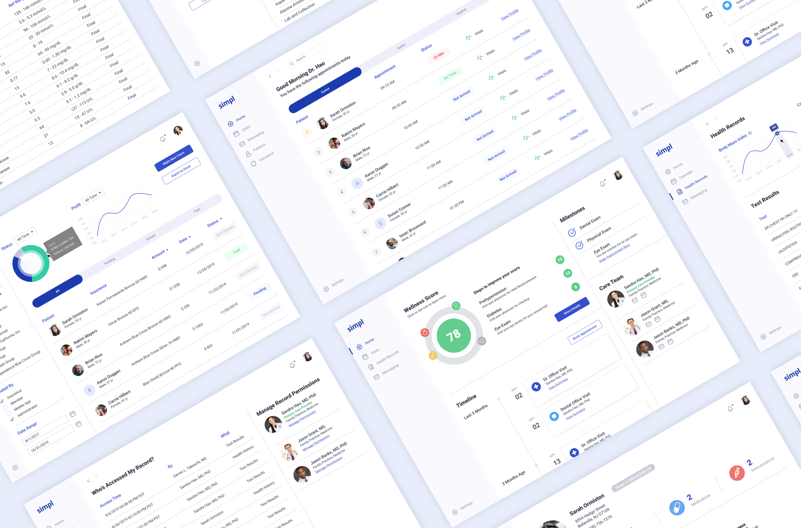
Organisms
Organisms are groups of molecules joined together to form a relatively complex, distinct section of an interface. In our app which was heavily content based, a lot of these organisms became content feeds, list views and content carousels.
TEMPLATES
Templates consist mostly of groups of organisms stitched together to form pages. It’s here where we start to see the design coming together and start seeing things like layout in action.
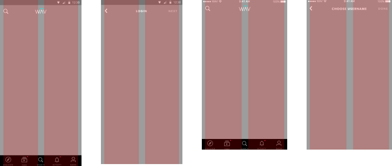
iOS Templates
Android Templates
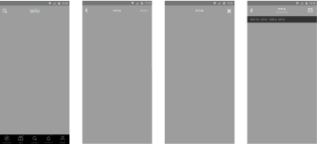
SCREENS
Screens are specific instances of templates. They are the highest level of fidelity and was what most stakeholder reviewed.
Being able to view all the pages in context allows us better iterate the design on the molecules, organisms, and templates to better address the real context of the design.
IMPLEMENTATION
Implementing the design system allowed us to quickly build across 3 platforms with a remote development team. Our process consisted of the design team creating a library of components within Figma. It was important for us to use the cloud-based design tool because it made it easier for us to manage files with the remote teams. Each of the components had formatting constraints set so that the componenets could be reused for different grid systems. Taking a list view for example, if the list view expanded to a wider device screen, the elements would maintain their original format and not get distorted.
We worked closely with the development teams to ensure the lexicon used between design and development was consistent when referring to component names. We then documented all the design systems and guidelines on an internal website and shared with the rest of the organization.
MORE PROJECTS